July 2018 - July 2019
National Cheng Kung University
UX Designer
End to end UX/UI design


- Observation the working environment of web-testers.
- Evaluating the heat-map
- Open Card-sorting
Discuss information structure with team. Discuss concepts with PM and Devs.
Ideate a solution and discuss with stakeholders with a prototype
- Prototyping in FramerX, Adobe XD
- Share design files with Zeplin.
To understand our users, we examined the working environment and working habits of web-testers.

1. Small UI is convenient for web-testers to multitasking with split-screen.
2. Due to the long period to watch the monitors, the eyes of web-testers will be tired. Some of the web-testers will use dark UI in their OS setting to protect their eyes.
So we decide to turn our product into dark UI.
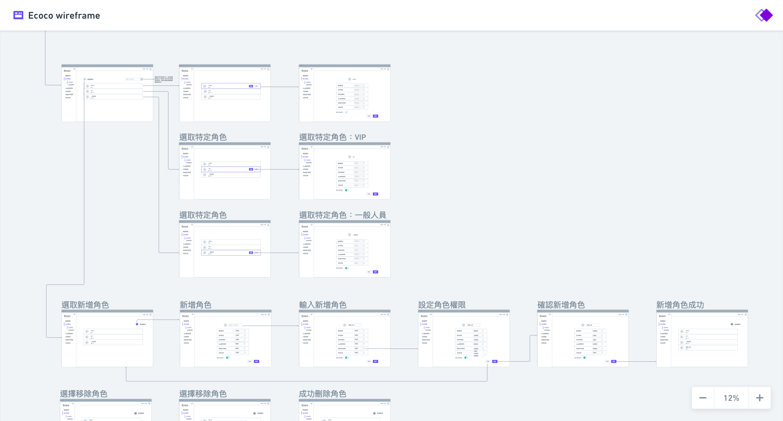
The past solution (SideeX 2) was an MVP. Due to the hurry deadline, the developer display every function on the same hierarchy. It was lack of Information Architecture (IA), which makes the product not easy to learn .
We decided to redesign it with a redefine IA fitting with the users' behavior based on past solution.
First, we examined the most often used function on the heat-map. We discovered that the most often use function were record, stop, pause, and speed. Based on the insights, I decided to move the button to the upper-right of the screen, which was the noticeable places in visual psychology.
And then I make them larger than other seldom used functions, and turn the significant feature "Record" button into red, so that we have a call to action effect, which make the software easier to learn.
Second, to make the UI cleaner, I decided to merge functions. To make sure users can understand the hierarchy of our new design, I decided to use open card-sorting method, which would ask the participants to sort and generate category fitting to their intuition. To simply the user testing process, we used an online service called Optimalsort to do our experiment. And then we create a site-map based on the result.


